matt duncan spruces up a landscape logo.
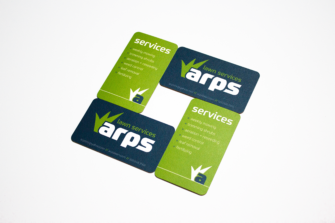
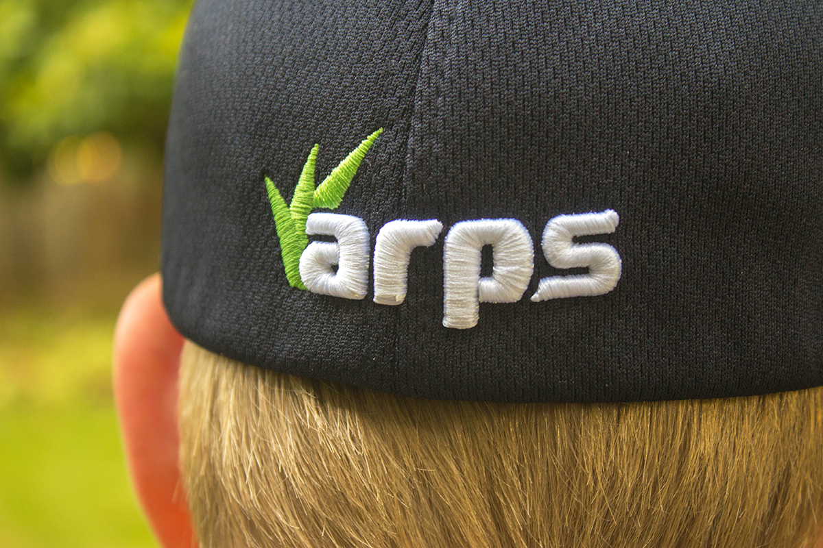
Arps is a company that provides various lawn care services to customers in Raleigh, Durham, Cary, Wake Forest, Morrisville, and Apex, North Carolina. They approached me to redesign their existing logo which had been in circulation for about ten years since their inception, as well as redesign their business cards to function as a checklist and pricing tool. They wanted something that was friendly and approachable, while professional and clean. The logo is on the hats and shirts of the workers so it really needed to “pop” for people passing by. They also wanted to incorporate a tagline or subtext to communicate the nature of their company.
Ultimately it was very rewarding to see the final transformation from the earlier design. I kept the lowercase feel of the earlier logo, as it provided a friendly and approachable tone. The letterforms are modified from Prometo, a sans serif typeface with a technological feel which provided a strong sense of professionalism and simplicity. I incorporated the grass tuft nested next to the “a” to work in tandem with the “lawn services” subtext, and provide context when it was omitted. One of the biggest shifts I implemented was a change in color scheme from the previous yellow and bright blue; the new colors provided the increased contrast and pop that they were looking for. The logo is designed to work best with and without the subtext on white as well as with an inverted look on dark blue.