matt duncan designs fading type.
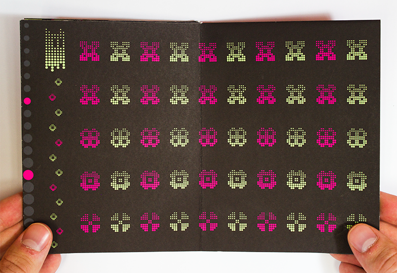
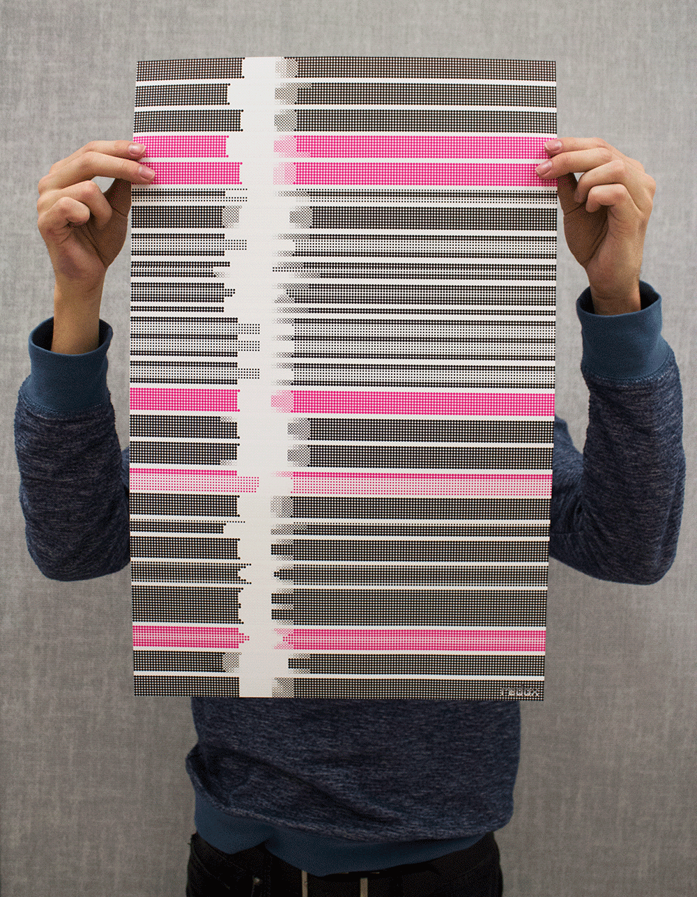
Redox is a modular typeface created to appear as if the letterforms taper off gradually. Each form is sculpted from the same matrix pattern of circles, in which the size of the modular units decrease incrementally as they venture further from the base line. The typeface takes form in a type specimen and an abstracted alphabetical poster.
Although it was sometimes frustrating, I thoroughly enjoyed the process of figuring out kerning for the letterforms and found an even higher sense of appreciation for the consistency within good body type. I also enjoyed creating custom glyphs for the typeface, including a mascot character to embody the idea of the typeface. Redox’s name is a reference to the process of oxidation reduction, in which molecules exchange electrons, causing the molecules to grow or shrink ever so slightly.